Apple has completely revamped the Mac operating system this year with macOS Big Sur, which also adds some interesting new features to the Mac. macOS Big Sur brings Control Center to the Mac for the first time, and just like on iOS 14, Mac users can have quick access to rich, dynamic widgets. Read on to learn more about Control Center and widgets on macOS Big Sur.
Control Center
Control Center on macOS Big Sur is visually similar to the Control Center on iOS but with controls adapted for the Mac. Instead of accessing it with a swipe, Control Center on the Mac can be opened by clicking on a new button in the Menu Bar.
From there, users can access network settings, brightness adjustments, AirPlay, and more. Some of these options were already available in the macOS Bar Menu before, but there are new features in the Control Center as well.
For instance, you can change the brightness of the backlit keyboard, Do Not Disturb, Dark Mode, Night Shift, AirDrop, and there’s even Now Playing controls. When you click on a specific area such as sound settings, Control Center shows more related options — in this case, sound output devices available.
The Bluetooth menu can now show the battery level of connected accessories, in addition to icons for Apple’s accessories like AirPods, Magic Mouse, and Magic Keyboard. And finally, with the new AirDrop menu, you no longer have to open Finder to change discovery preferences.

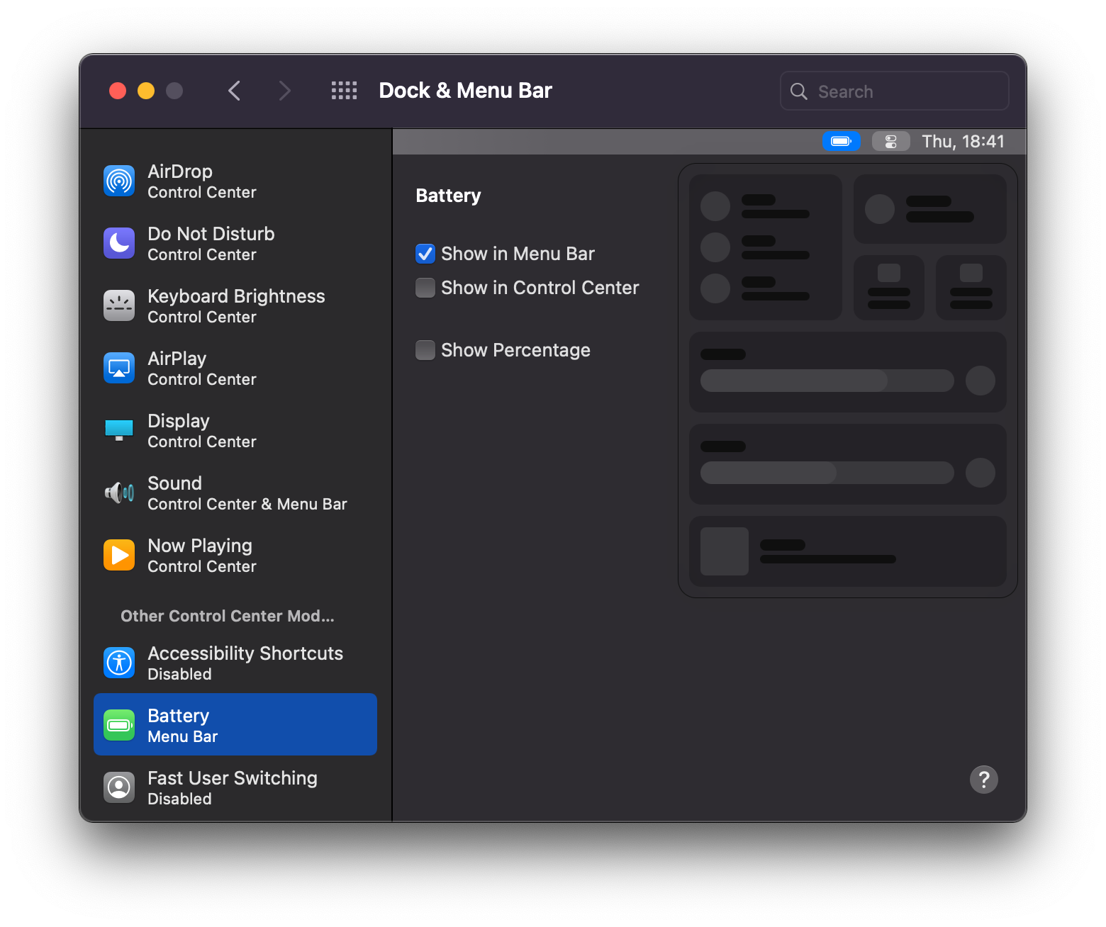
What’s also great about Control Center on macOS is that users can drag controls to the Bar Menu, making them even easier to access. The opposite is also possible, with a new option to hide items from the Menu Bar, making them available only in Control Center.

Widgets
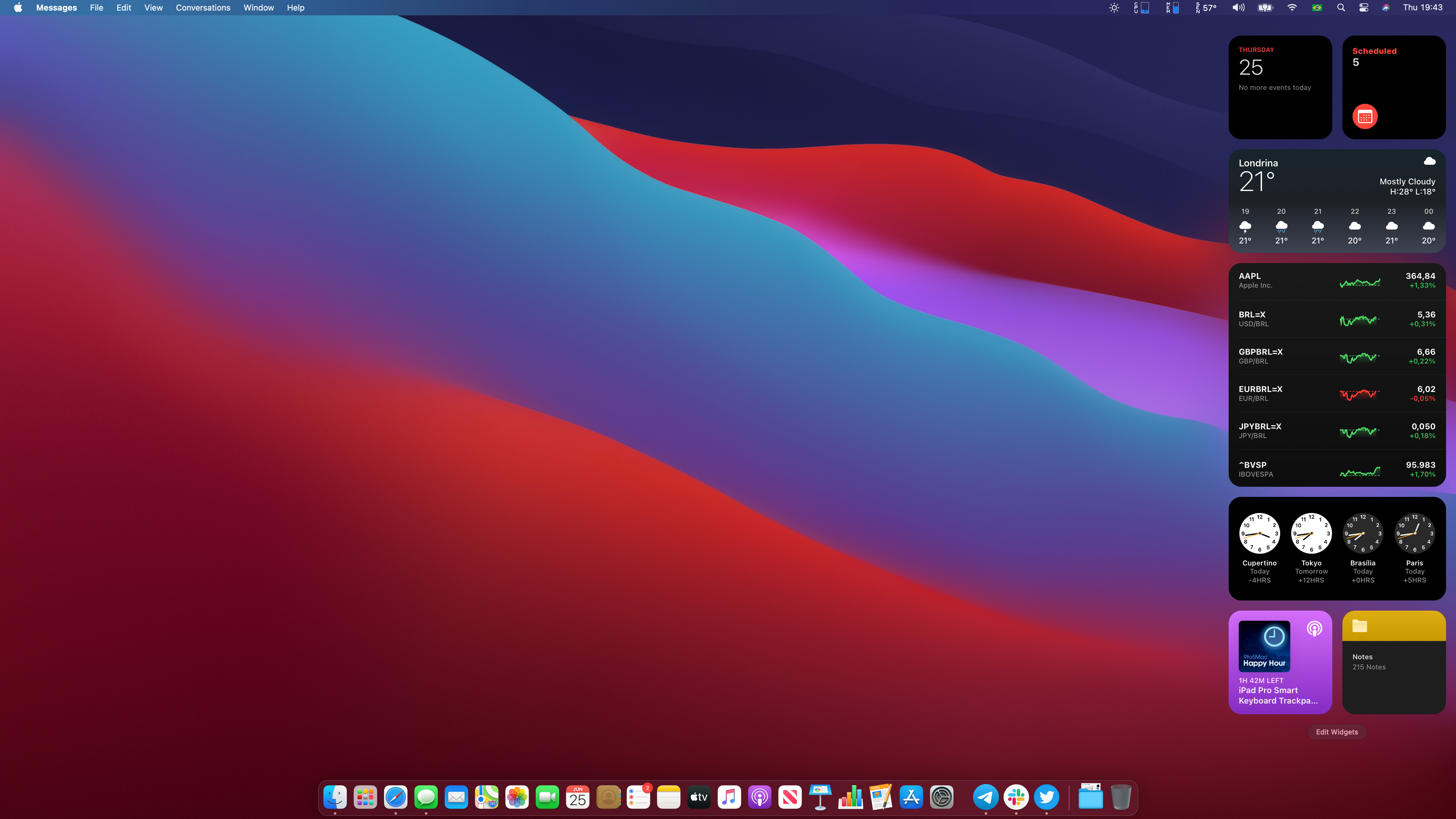
The new widgets experience on macOS Big Sur is similar to what iPadOS 14 offers. That’s because you can’t fix these widgets on your home screen or Desktop. With macOS Big Sur, widgets are accessible by clicking on the time in the Bar Menu where the Notification Center button was previously located.
Notification Center has been integrated with the widget panel, but for some unknown reason you can’t access it with gestures on the trackpad — I hope that’s just a bug. Widgets and notifications are shown over apps, and you can scroll vertically through them.
It’s true that macOS already had widgets since OS X Yosemite, but this year, Apple is doing something better. These widgets that you have on macOS Big Sur are the same ones that are available on iOS 14. That means if you’re running a universal iOS app that contains a widget, you’ll also get it on Mac.

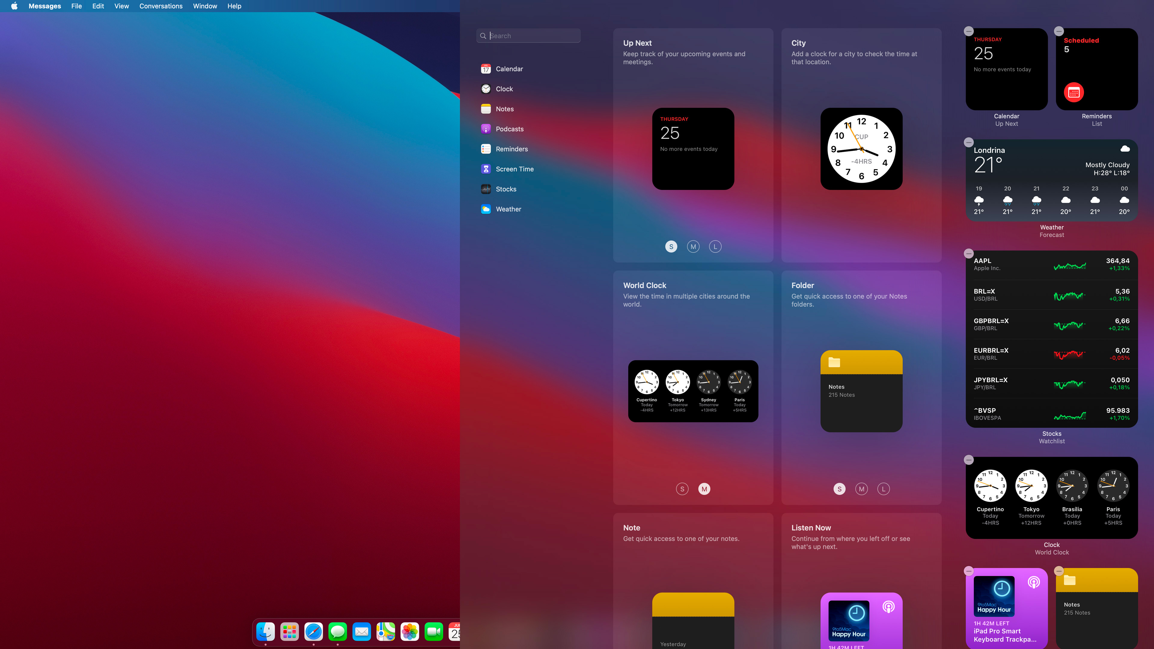
Pressing the Edit Widgets button opens a new panel where you can select new widgets or reorder current ones. Right now, these are the widgets available with macOS Big Sur beta 1: Calendar, Clock, Notes, Podcast, Reminders, Screen Time, Stocks, and Weather. You can choose three different sizes of widgets, just like on iOS 14 and iPadOS 14.
Apple says widgets are focused on showing useful information quickly, so don’t expect deep interactions with them. Most widgets don’t even have buttons. Even so, they’re all well-designed, and I think they have the potential to get even better when developers release their own widgets later this year.

Apple is undeniably making macOS more similar to iOS in many ways, and while there are many people who like that, others claim that the Mac is losing its own identity.
What do you think about that? Do you like the changes made to macOS Big Sur, or do you think they’re not necessary? Let us know in the comments section below.
FTC: We use income earning auto affiliate links. More.

Check out 9to5Mac on YouTube for more Apple news:
Technology - Latest - Google News
June 26, 2020 at 07:48AM
https://ift.tt/3i2OCRg
Here’s a first look at the new Control Center and widgets on macOS Big Sur - 9to5Mac
Technology - Latest - Google News
https://ift.tt/2AaD5dD
Shoes Man Tutorial
Pos News Update
Meme Update
Korean Entertainment News
Japan News Update
Bagikan Berita Ini


0 Response to "Here’s a first look at the new Control Center and widgets on macOS Big Sur - 9to5Mac"
Post a Comment