Apple's slickly produced WWDC20 keynote didn't directly emphasize it, but the new macOS Big Sur that will ship to the public this fall is officially "macOS 11," marking an end to the twenty-year progression of "Mac OS X" branding. But don't worry, it's not the end of the Mac.
Turn it up to 11
Apple's first beta of macOS Big Sur was made available to developer program members with the version designation of "10.16," which is what one might expect from the successor to last year's Mac OS 10.15 Catalina. But Apple likes to switch things up and keep things interesting.
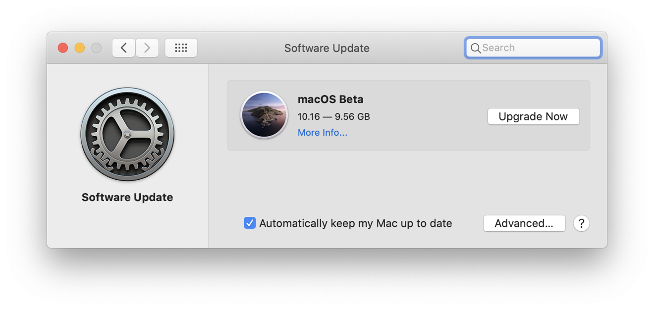
The Big Sur beta was originally called 10.16
In this case, the move to macOS 11 was a subtle reveal. Speaking from the hands-on area of the Steve Jobs Theater during the WWDC20 keynote, Apple's head of software Craig Federighi showed screenshots that indicated the new release was finally pushing past the big "X" that has defined the Mac experience for 20 years.
Apple's fresh 2020 update to its developer Human Interface Guidelines now consistently refers to Big Sur as "macOS 11," rather than being another incremented version of the "Mac OS X" brand that first shipped as a public beta in 2000 and as an initial "Mac OS X 10.0" public release in 2001.
Across the last two decades, Apple has released major new versions of its modern OS for the Mac at regular intervals. Since 2016, it has deemphasized the Roman numeral "X," shifting its marketing name to simply "macOS." It has also increasingly capitalized on its annually changing "code name" assigned to each release — first big cats, then places in California — relegating the actual version number increasingly out of prominent view.
The move beyond "X" to 11 may seem concerningly ominous, but it really just reflects a series of moves Apple has made to better align its work on the Mac desktop with its mobile platforms. After 14 years of iOS releases, we are now getting a simple, streamlined annual version number for the Mac as well.
The Mac isn't going away, it's catching up
A number of observers have suggested that Apple is losing its interest in the Mac platform, and fear that Apple is making plans to replace its 35-year-old, conventional computing platform with, effectively, a scaled-up version of iPadOS. They cite developments such as Catalyst, which helps developers bring their existing OS code to the Mac, or the new move to Apple Silicon Macs, which will enable future hardware to run iOS software without any modification.
Some have pointed to the new UI refinements in Big Sur that look like a modern departure from the traditional Mac appearance with its squared panels, rigid alignments, and more dramatic contrasting of dark monochrome regions. The default Big Sur desktop in the first beta makes the new, updated appearance took particularly radical due to its use of intense colors (below). Is this the end of the beloved Macintosh? Is it becoming "just a big iPod touch"?
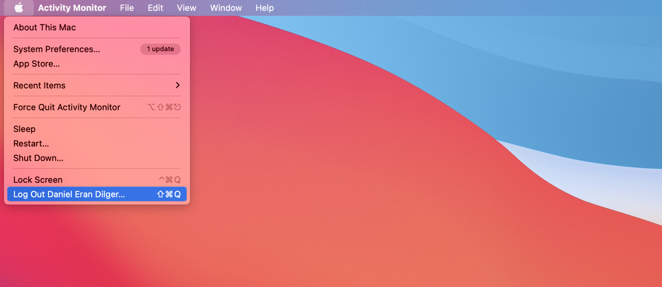
Change the default wallpaper (above) to the photo of California's Big Sur (top) and the whole thing looks less foreign and garish
I don't think so. Instead, I think the changes Apple is making to the Mac are in the right direction, even if they do touch that part of the brain that incites fear and concern simply because things are new, different, and slightly less familiar. There are some transition issues and rough edges— like the brand new Battery panel that replaces the confusing old mess of "Energy Saver"— but this is the first developer beta. Things are still in flux and changes are being hammered out.
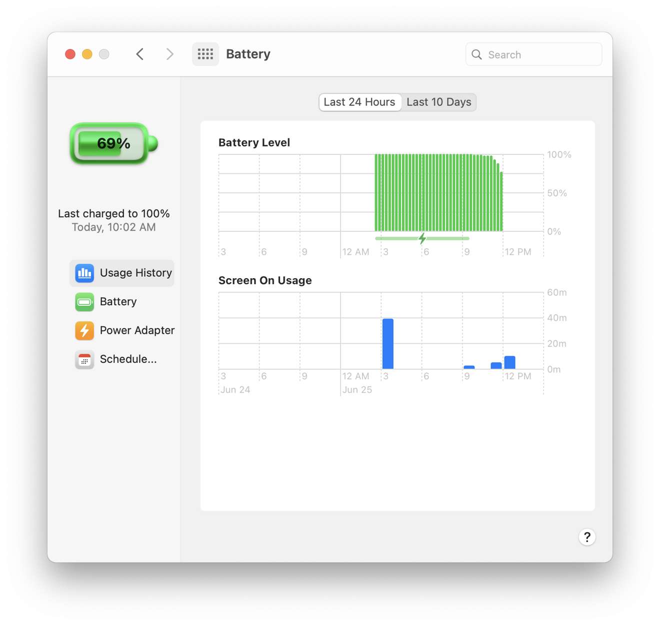
Did Apple hire Google's emoji team to draw up this weird condom battery?
Rather than being disgruntled that some things on the Mac are changing and — horrors! — reflecting the work Apple's already done for iPadOS, it's useful to look at things from the other direction. For years, the Mac has received less of Apple's attention and resources simply because the market opportunities afforded by iPhones and iPad were vastly larger.
Over the last decade, the work needed to deliver leading smartphone and tablet technology was urgent, while the Mac mostly just needed refinements to keep it comfortably competitive with commodity PCs and netbooks. Three years ago, Apple was consumed with reinventing iPhone X, and since then it has focused on differentiating and radically enhancing its "new" iPadOS platform.
Back to the Mac
The new Big Sur borrows a series of familiar, functional improvements from Apple's years of work that focused on iOS. One great example is the new Control Center, which brings the same clean, intuitive, configurable layout of quick settings to the Mac.
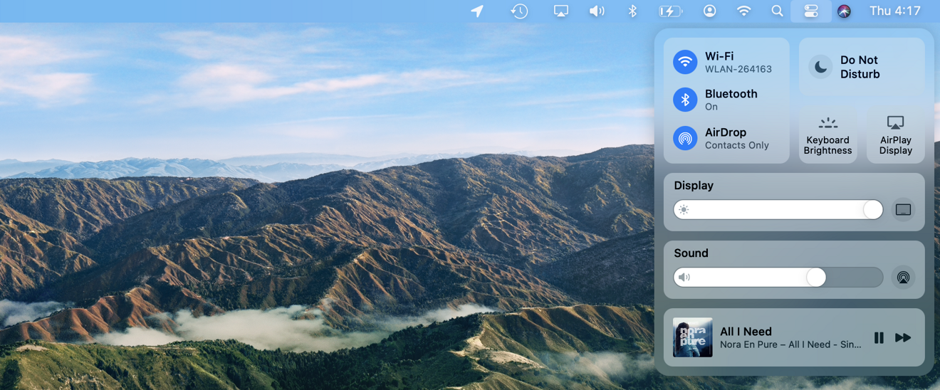
Big Sur's new iOS-inspired Control Center is beautiful and brilliant
One of Apple's biggest efforts in last year's macOS Catalina was to break up its monolithic iTunes into a series of modern, streamlined apps, reflecting how things worked under iOS. In our review of Catalina, one of the problems we noted was the increasing lack of visual and user interface consistency across its various bundled apps, a gap that kept growing as batches of new apps with their own fresh interface style erupted with each new release.
Certain older apps looked like they were stuck in different points of the past because they literally were. As Apple's internal development tools kept changing over the years, some of the oldest code remained difficult to modernize or harmonize with the rest of the system.
Instead of spending the last couple years working to bring various old macOS components up to date with the Mojave appearance, Apple instead began charting out a much bolder and material leap: a jump to its own Apple Silicon at the lowest layer of the stack, as well as a radical new approach to building high-level appearance and behavior in the new Swift UI. In tandem, Apple also introduced Catalyst as a way to bring existing iOS code to the Mac.
All three represent huge investments in enhancing the Mac platform and preparing it for the future. They expand the library of software that Macs can run while transferring and adapting some of the tremendously valuable UI work already performed for mobile devices to desktop Mac systems tuned to handle larger and more complex tasks. These changes actually make the Mac more commercially relevant and a stronger platform.
Critics have fixated on niggling appearance issues in the initial Catalyst apps and worried that the cherished Mac look and feel was going away. The truth is: it is. The Mac is increasingly modernizing, leveraging new, more flexible code that supports features ranging from accessibility and internationalization to Dark Mode. Mac stalwarts might be tempted to blame the iPad or iOS, but the real force for change is Swift UI, Catalyst, Symbols, and other modern UI techniques and technology that simply appeared on iPad and iPhone first because they were receiving the most attention from Apple.
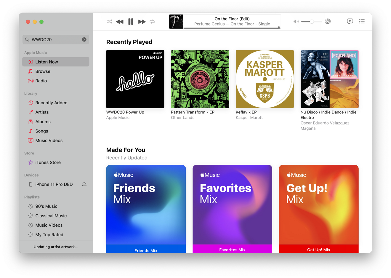
Big Sur borrows tech from iOS, such as Symbols, to enhance the Mac and make it more consistent
It's fine to critically examine the visual changes Apple is introducing in Big Sur, but consider evaluating these as inherently positive changes that are not yet finalized. The impact of Big Sur changes may seem more radical simply because they are more consistently applied across the entire macOS than in previous releases. That in itself indicates that rather than just being an arbitrary "new look" for new apps, the changes are a more fundamental rethinking of how to keep software modern and maintainable, and therefore more consistent.
At WWDC20, Apple has devoted a lot of work to show developers how they can leverage the latest tools, particularly Swift UI, to create clean app interfaces that are uncluttered, consistent, and intuitive to use, while also supporting modern functionality and being prepared to adapt to future OS features as they are delivered.
Technology - Latest - Google News
June 25, 2020 at 11:51PM
https://ift.tt/2CA3w0W
Apple's macOS 11 Big Sur marks the end of OS X, not the Mac - AppleInsider
Technology - Latest - Google News
https://ift.tt/2AaD5dD
Shoes Man Tutorial
Pos News Update
Meme Update
Korean Entertainment News
Japan News Update
Bagikan Berita Ini


0 Response to "Apple's macOS 11 Big Sur marks the end of OS X, not the Mac - AppleInsider"
Post a Comment