Hands On In its publicity for Windows 11, Microsoft has focused on the "simplified design and user experience" of the operating system along with a few headline features: a centered Start menu that looks more like a dock from other OSes, Android apps in the Microsoft Store, Teams Chat in the taskbar, Widgets, and more.
Android software support aside, these are relatively superficial features, and Microsoft will not dare to introduce changes that might break application compatibility with Windows 10. The IT titan already sparked a backlash by stating that 7th-generation Intel Core processors will not be sufficient to run the new Windows, though there are signs the company is open to "adjustments we should make to our minimum system requirements," subject to feedback from its Insider's preview scheme.
We have been running the latest insider preview of Windows 11 (21H2 Pro, OS build 22000.71) together with the refreshed Office insider build, and while it is generally not unpleasant, there are small changes which we think could prove annoying – though note that everything here is subject to change as this is just a preview build. A full official release is due to land by the end of this year.
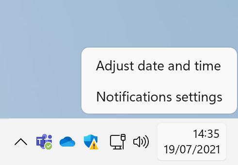
For example, it is second nature for some to right-click the taskbar to summon the Task Manager, perhaps in the hope of discovering why a supposedly fast PC is acting like it's wading through glue. But the equivalent pop-up menu in Windows 11 has just two entries, Adjust date and time, and Notification Settings. Task Manager? We may need to get used to typing Windows + X, which brings up what is sometimes called the Power Menu, with quick access to a bunch of apps and settings including Task Manager.
We have not yet discovered though how to access one of our favorite settings, which is "Always show all icons in the notification area." The notification area is the bottom right corner of the screen, where background applications often show an icon with a right-click menu.
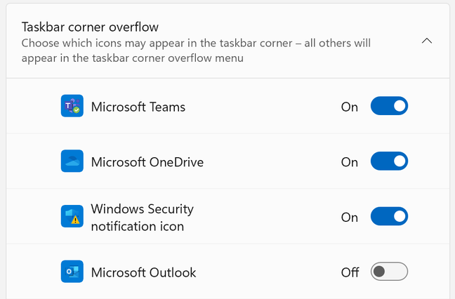
Showing these icons gives insight into what is running; but the default is to hide them behind a pop-up menu. In Windows 11, this area seems to be renamed the "taskbar corner," and the pop-up menu the "taskbar corner overflow," and while you can still select which icons appear, there is no option we can see to show them all by default.
If the centered Start menu and taskbar icons aren't to your liking, you can shove them to the left, as on Windows 10, in Windows 11's personalization settings.
Removed features
The curious can find the official list of removed and deprecated features here. Removed features include Quick Status on the lockscreen, S Mode (except in Home edition), Tablet Mode, and the ability to align the taskbar other than to the bottom of the screen.
Tablet Mode is a sad story. Although Windows 8 failed to convince users for all sorts of reasons, it was cleverly designed for touch users, more so than any version of Windows before or since (excepting perhaps Windows Phone). Tablet Mode was meant to restore a touch-friendly experience in Windows 10, but never worked right and caused confusion.
That said, Redmond appears to have a replacement in the form of "new functionality and capability for keyboard attach and detach," as this Microsoft representative notes. These include spaced-out icons and new gestures, and possibly a new touch keyboard. Microsoft will have optimizing this in mind for its new and recent Surface devices.
The Windows 11 Start menu is not necessarily an improvement. The Start menu was brilliant in Windows 95, brutally transformed in Windows 8, and reinvented in Windows 10 as an application menu with an optional resizable and customizable panel on one side, to retain some compatibility with Windows 8 Live Tiles.
Out of the box, the Windows 10 Start panel is an annoyance, but with a bit of effort can be made into a useful application launcher, with named groups and icons that in some cases come in four sizes: small, medium, wide or large. The Photo app is an example, which can not only be set large but will also cycle through recently added photos and images.
In Windows 11, Live Tiles, named groups, and resizable panels have been swept away. The new Start menu has little to customize, though users can still pin apps to a fixed space in its top half, which scrolls when full (a grid of 6 x 3 icons on our system). Plenty of room is given to a "Recommended" panel of doubtful value. There is also a small "All apps" button, which is similar to the classic pop-up Start menu of yore, and "Type here to search," which searches across applications, documents, web, settings and more, giving the user a perplexity of results.
Settings app better, File Explorer worse?
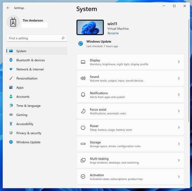
One thing at least is better in Windows 11. The design is much cleaner, for those parts of the software that use the modern user interface, such as the system's Settings application; it makes Windows 10 look homemade by comparison.
This Settings applet is supposed to be more friendly than the classic Control Panel, which on Windows 11 looks almost identical to the Windows 10 Control Panel, save for a few icon changes that are neither better nor worse. For some network settings, it is still necessary to go to the Control Panel's "Network connections," though the Windows 11 modern Settings applet provides some network configuration options not found in the Windows 10 Settings, including adapter options like DHCP, DNS, interface enable and disable, and more.
Even Windows backup is still there in Control Panel, under the mysterious label "Backup and Restore (Windows 7)." This is the same as on Windows 10, though worth mentioning here, since unlike the strongly promoted File History in the Settings applet, this old-style backup actually is a full backup of the system that can be saved to a drive and taken offline – just the thing in these days of ransomware. Note that searching for backup in the Settings applet finds only "Back up and Sync your settings," at least on our Windows 11 Pro setup. In order to find the full backup feature, users have to locate Control Panel, then search for backup. Alternatively, one could type sdclt at the command prompt.
This is the kind of anomaly that keeps Microsoft partners in business. Note also that although this type of full backup is deprecated, users who install the presumably hot and current Azure Backup software will find that it looks remarkably similar, though it targets Azure storage instead of a local drive.
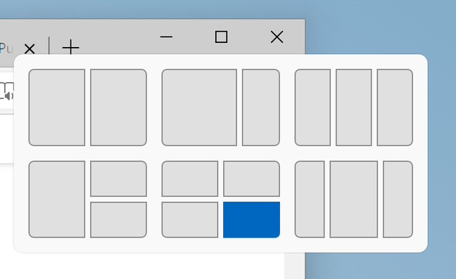
Another thing to mention is the Snap navigator. Hover the mouse over a window's maximize button, and a Snap window appears, which lets users resize and reposition the window in one of several positions. Useful? Some may love it though we did not find much value in this. For those who work with a huge display, it could be handy.
Windows File Explorer has been redesigned in Windows 11. This is where some users spend a lot of time while others hardly know what it is. It packs in a lot of functions: file management (copy, paste and move), file security, document preview, document search, and more.
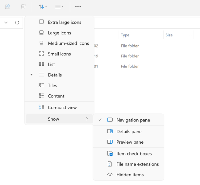
The new design no longer has a ribbon menu, and at first glance seems less functional: there are just a few icons across the top. That said, several of the buttons have drop down menus, such as for sorting and grouping, layout, and selection.
It seems that everything is still there; the ribbon is no longer in fashion, and rather than go back to old-style drop-down menus, Microsofties have chosen a hybrid in which the menus drop down from buttons. Improvement? One can see that the designers are aiming for a simple, clean appearance; but what is lost is discoverability, something the ribbon design was good at surfacing. The new File Explorer is not altogether a success.
Will Windows 11 always be a free upgrade from Windows 10? According to an official document available from some OEMs, and declaring itself "CELA [Corporate External and Legal Affairs] approved," the "free upgrade offer does not have a specific end date for eligible systems. However, Microsoft reserves the right to eventually end support for the free offer. This end date will be no sooner than one year from general availability."
The document also states that: "You do not have to upgrade to Windows 11. We will continue to support Windows 10 until October 14, 2025." To grab a copy of a preview build, follow these instructions. ®
Technology - Latest - Google News
July 20, 2021 at 03:59AM
https://ift.tt/3zcUH5k
Windows 11: We we like and don't like about Microsoft's operating system so far - The Register
Technology - Latest - Google News
https://ift.tt/2AaD5dD
Shoes Man Tutorial
Pos News Update
Meme Update
Korean Entertainment News
Japan News Update
Bagikan Berita Ini


0 Response to "Windows 11: We we like and don't like about Microsoft's operating system so far - The Register"
Post a Comment